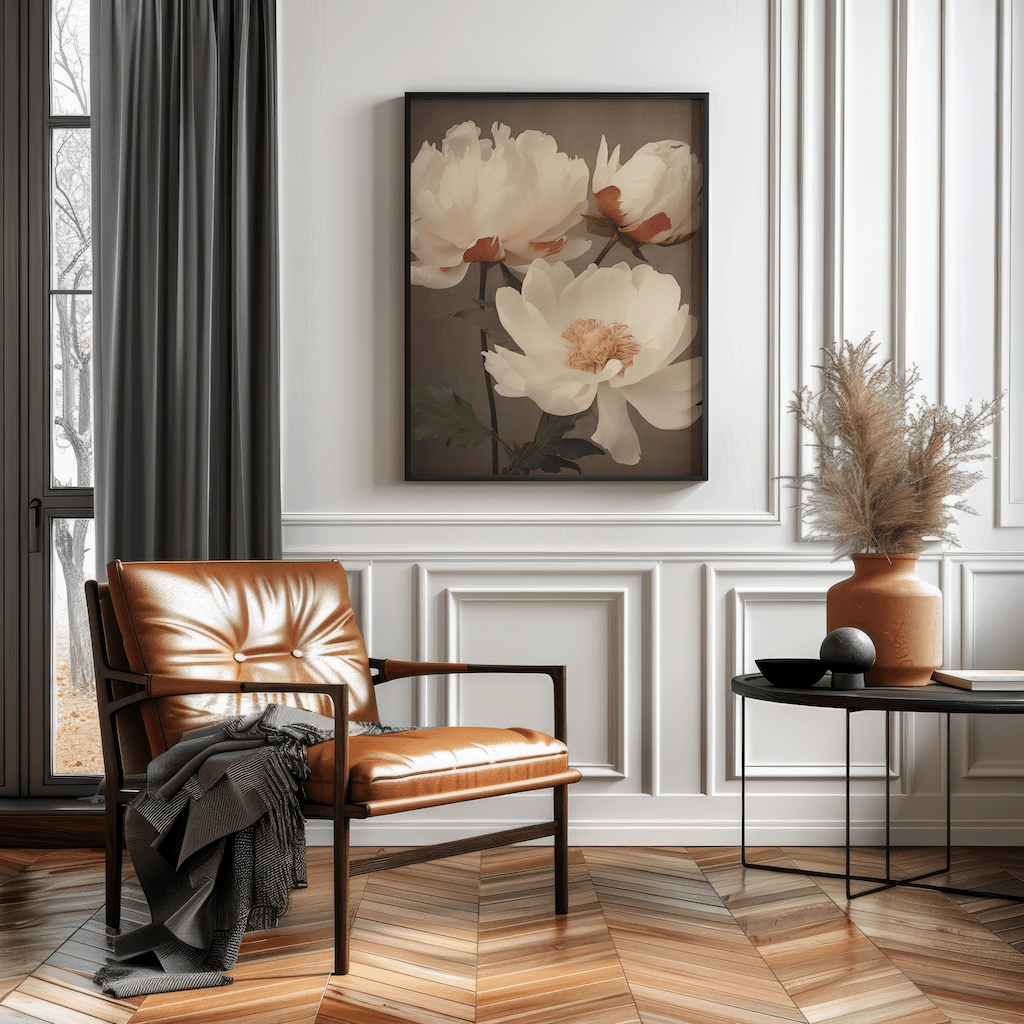
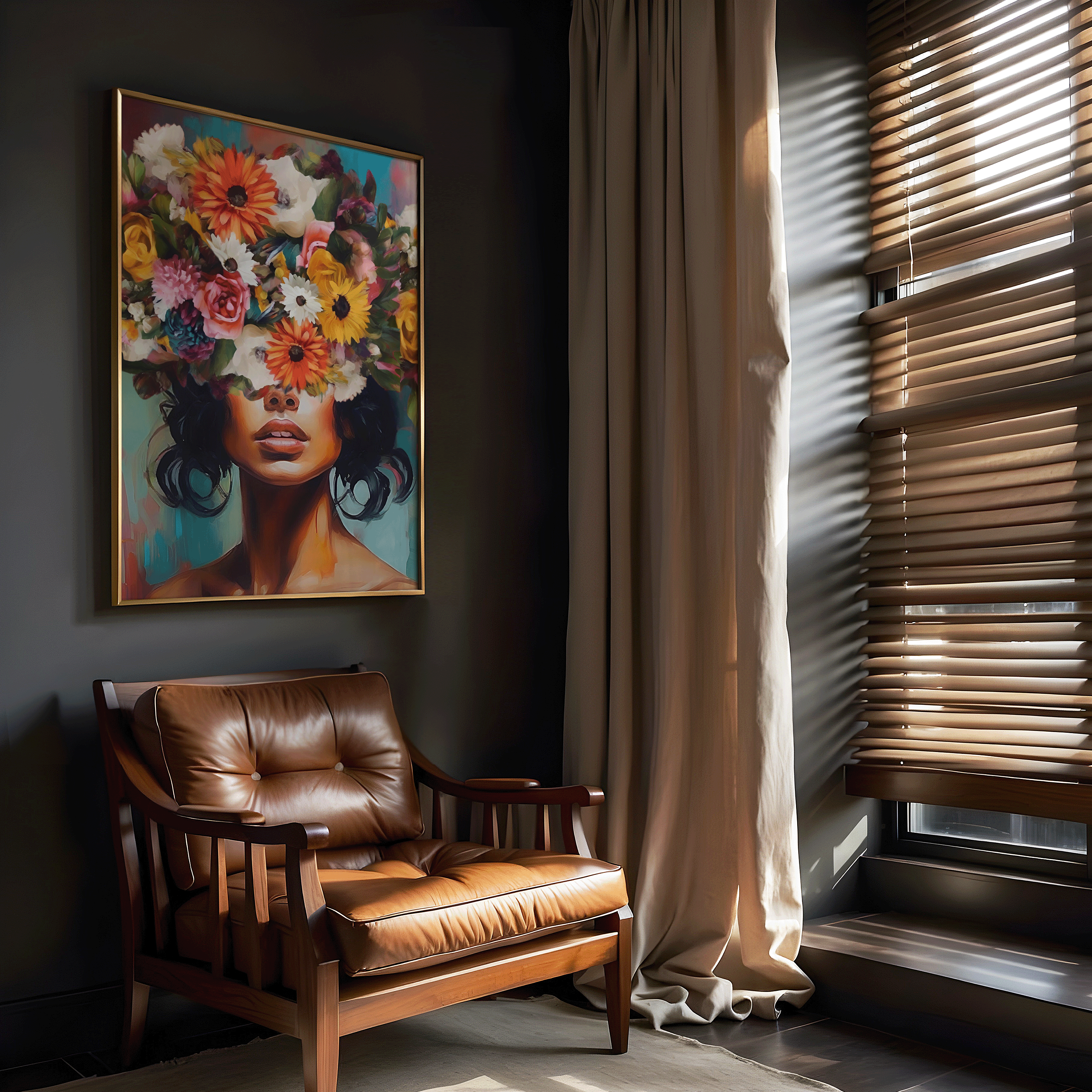
Hanging wall art can completely transform a room, but only when it’s placed correctly. One of the most reliable design principles used by interior designers is the 2/3 rule. This simple guideline helps you choose the right size and placement so your artwork feels balanced, intentional, and visually connected to the space.
If you’ve ever looked at a wall and felt like something was “off,” the issue is usually placement. The 2/3 rule solves that problem and works in nearly every room, from living spaces to bedrooms and entryways.

Key Takeaways
- The 2/3 rule helps determine the ideal size and placement of wall art
- Artwork should typically span about two thirds of the furniture beneath it
- Proper placement improves balance, flow, and visual harmony
- Following the 2/3 rule makes artwork look professionally styled
- Using the right wall art size, spacing, and placement helps create a balanced focal point and prevents empty or overcrowded wall space
What Is the 2/3 Rule for Wall Art?
The 2/3 rule means your wall art should be approximately two thirds the width of the furniture it hangs above. This includes sofas, beds, console tables, and dining room furniture.
For example, if your sofa is 90 inches wide, your artwork or grouped frames should measure around 60 inches wide. This proportion keeps the art from looking too small or disconnected from the furniture and creates a cohesive focal point.
Designers rely on this rule because it works across nearly all room types and styles.

How the 2/3 Rule Applies to Different Spaces
Above a Sofa or Couch
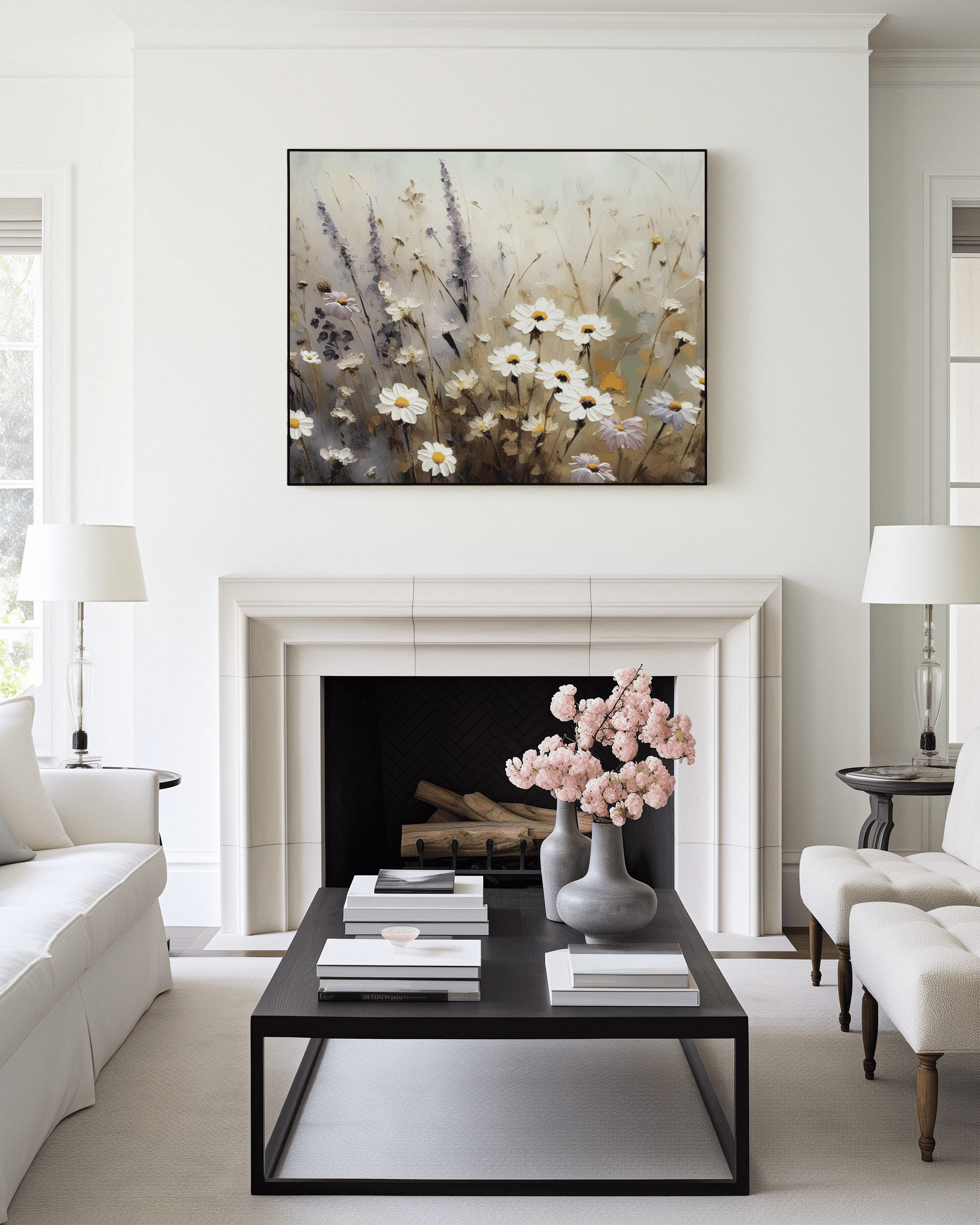
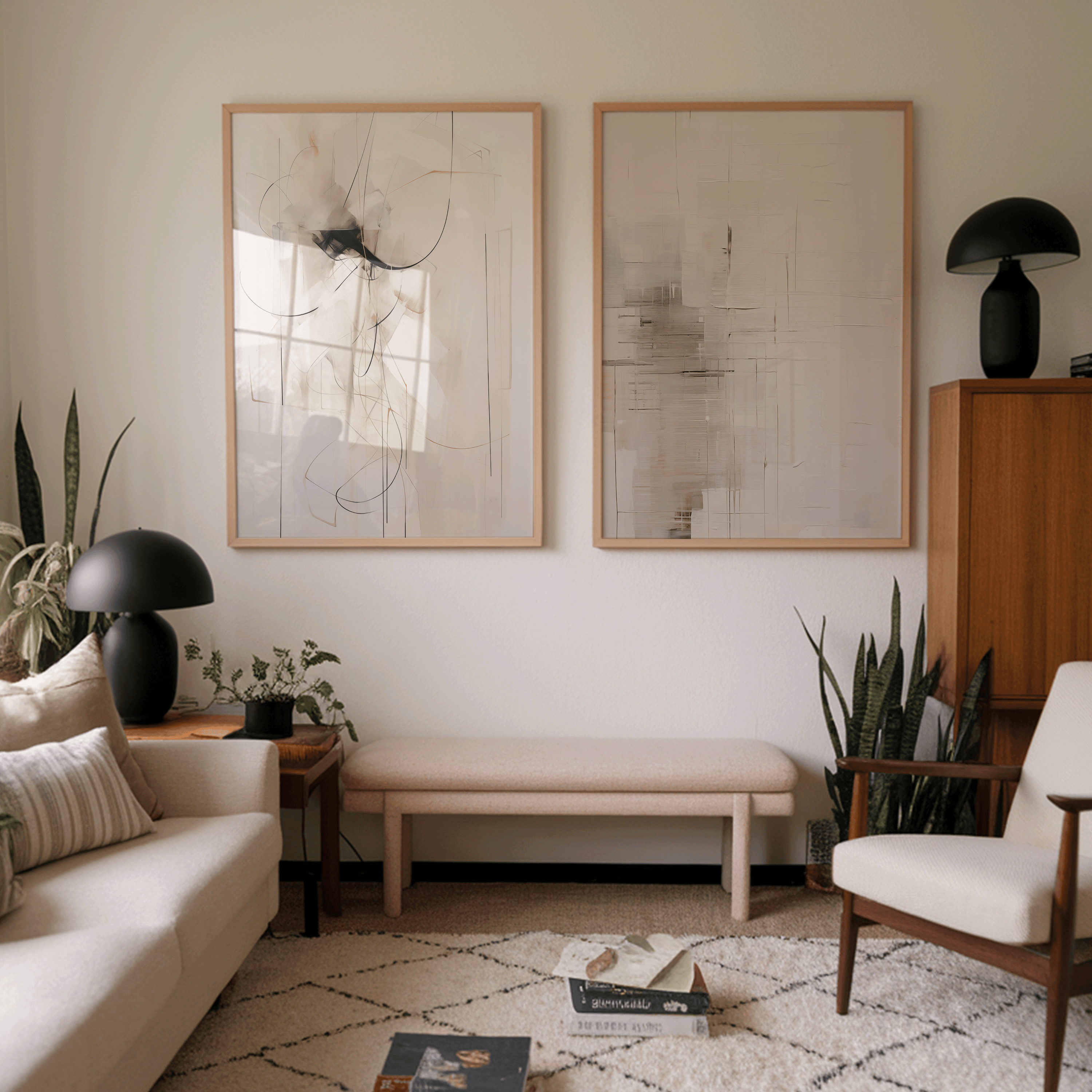
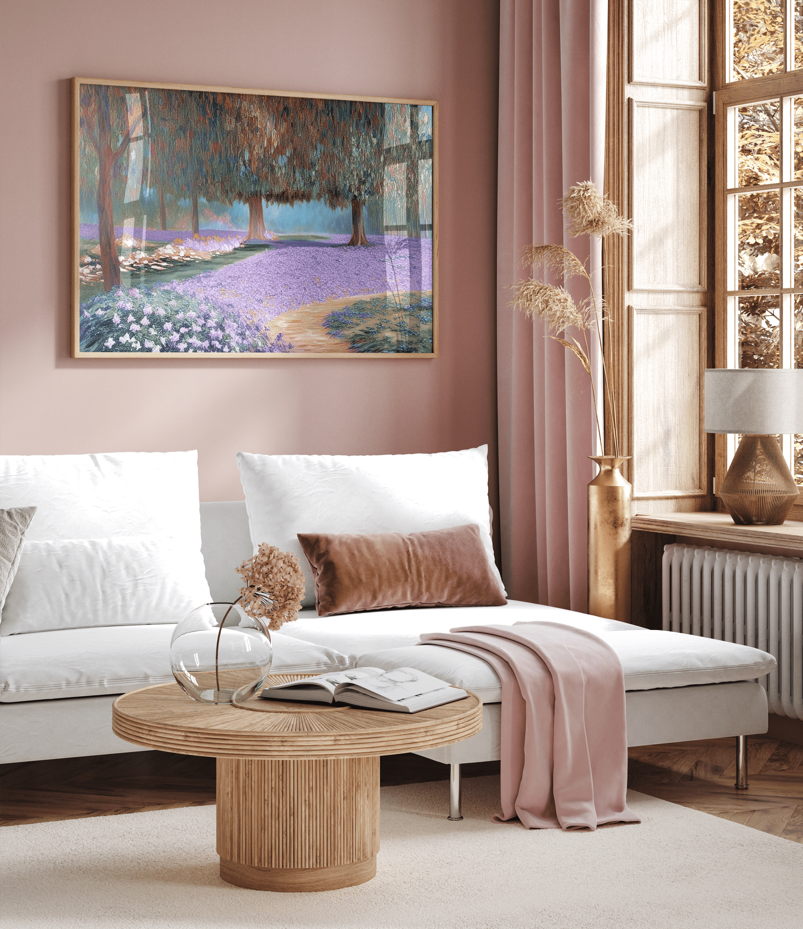
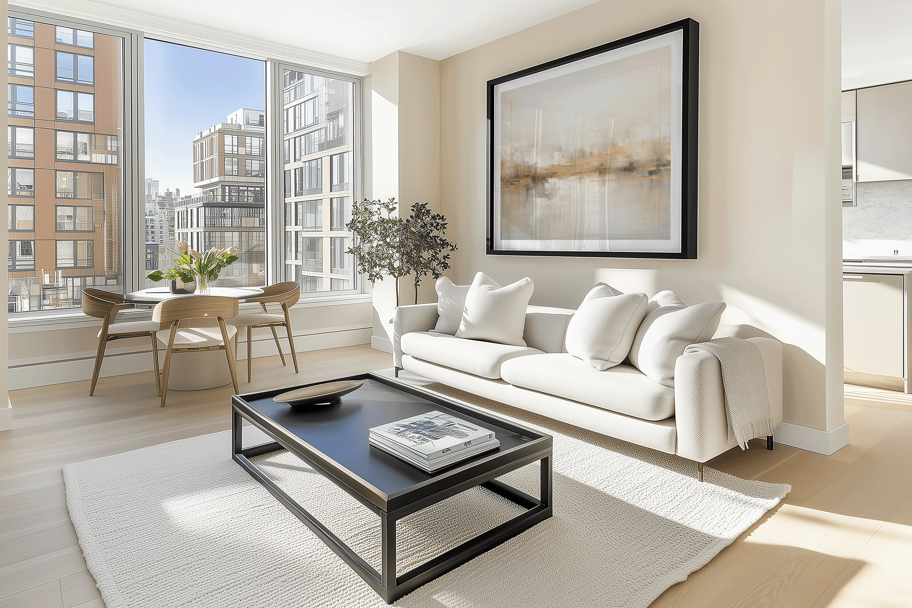
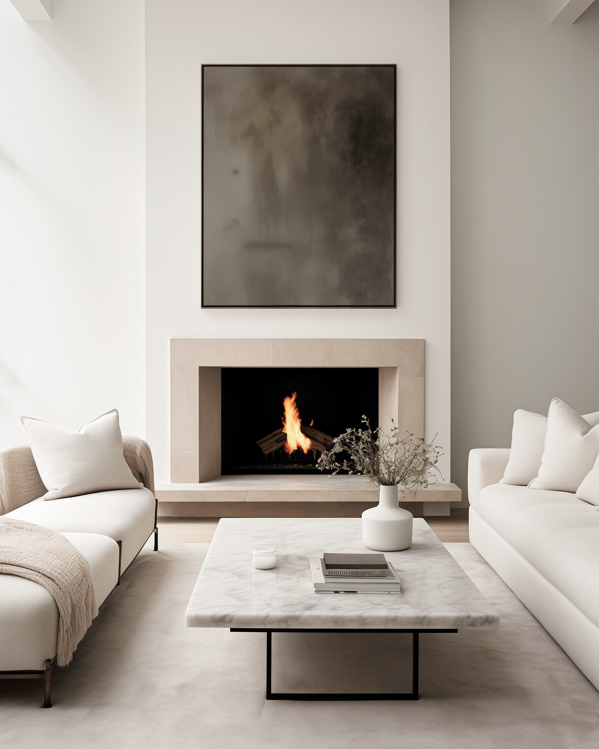
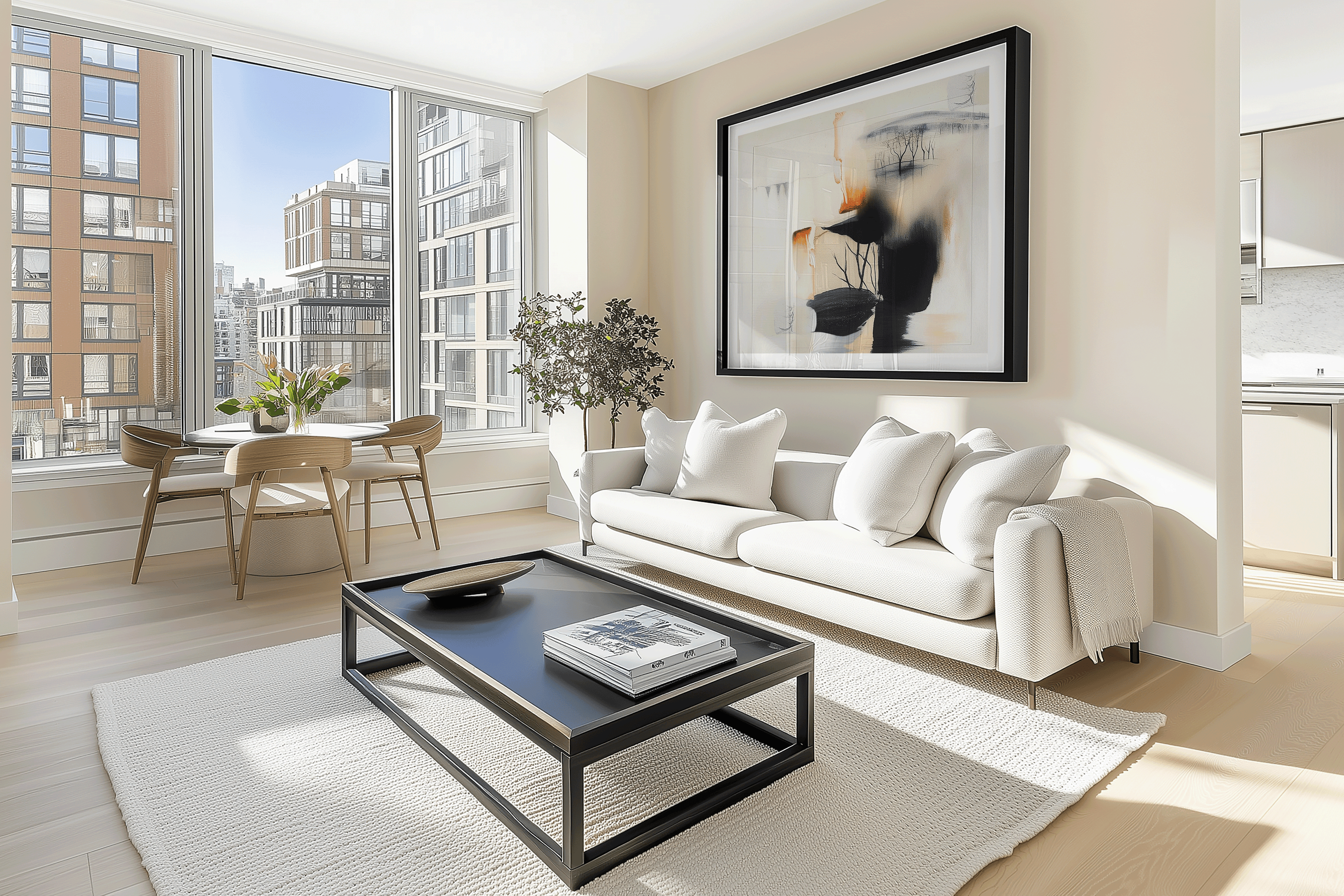
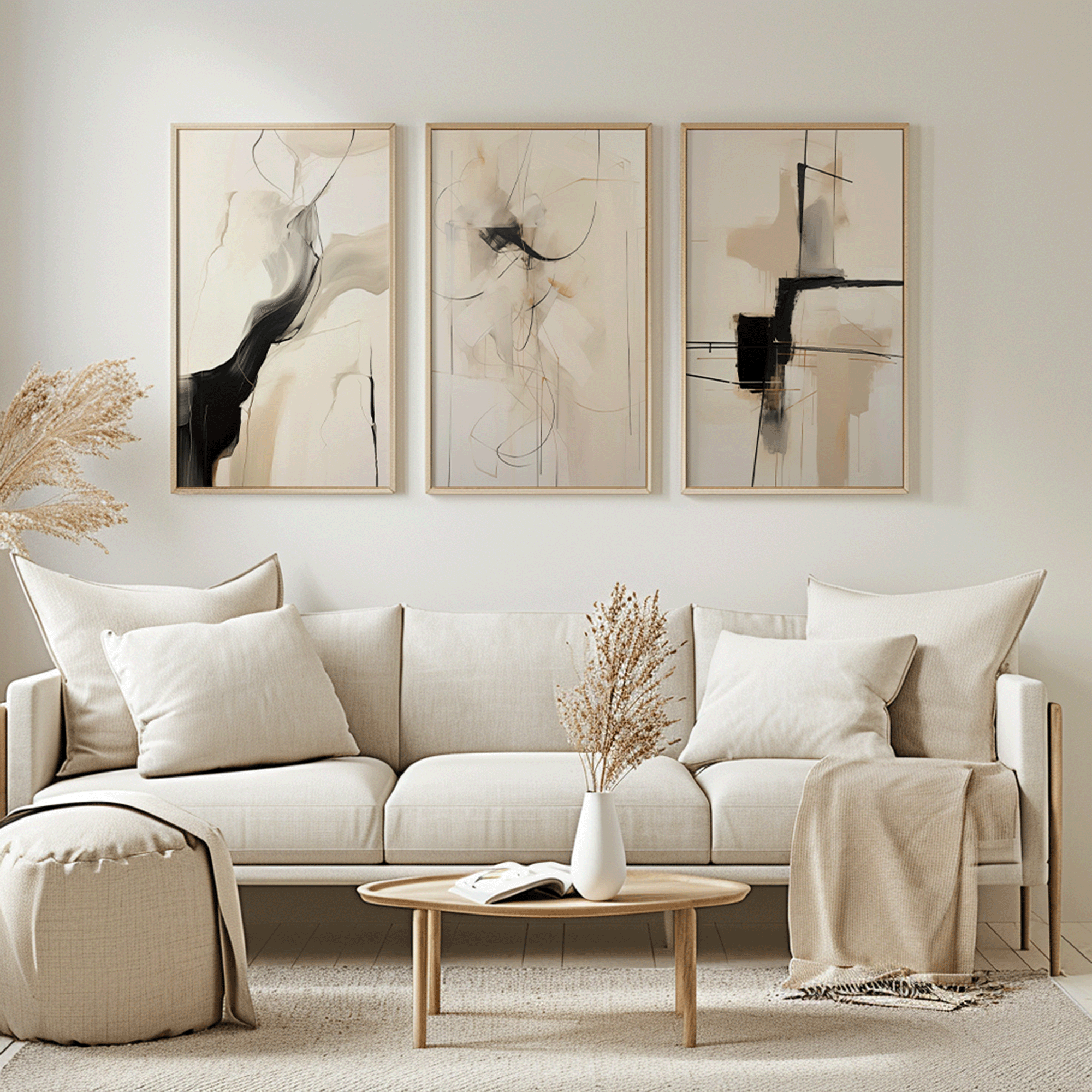
When hanging artwork above a sofa, the piece should span about two thirds of the sofa’s width. This approach helps create a balanced look by aligning artwork with the furniture beneath it, rather than letting it float awkwardly on the wall. It keeps the wall from feeling empty and avoids the mistake of hanging art that feels too small or floating. The bottom of the frame should sit about 6 to 8 inches above the back of the couch.

Above a Bed
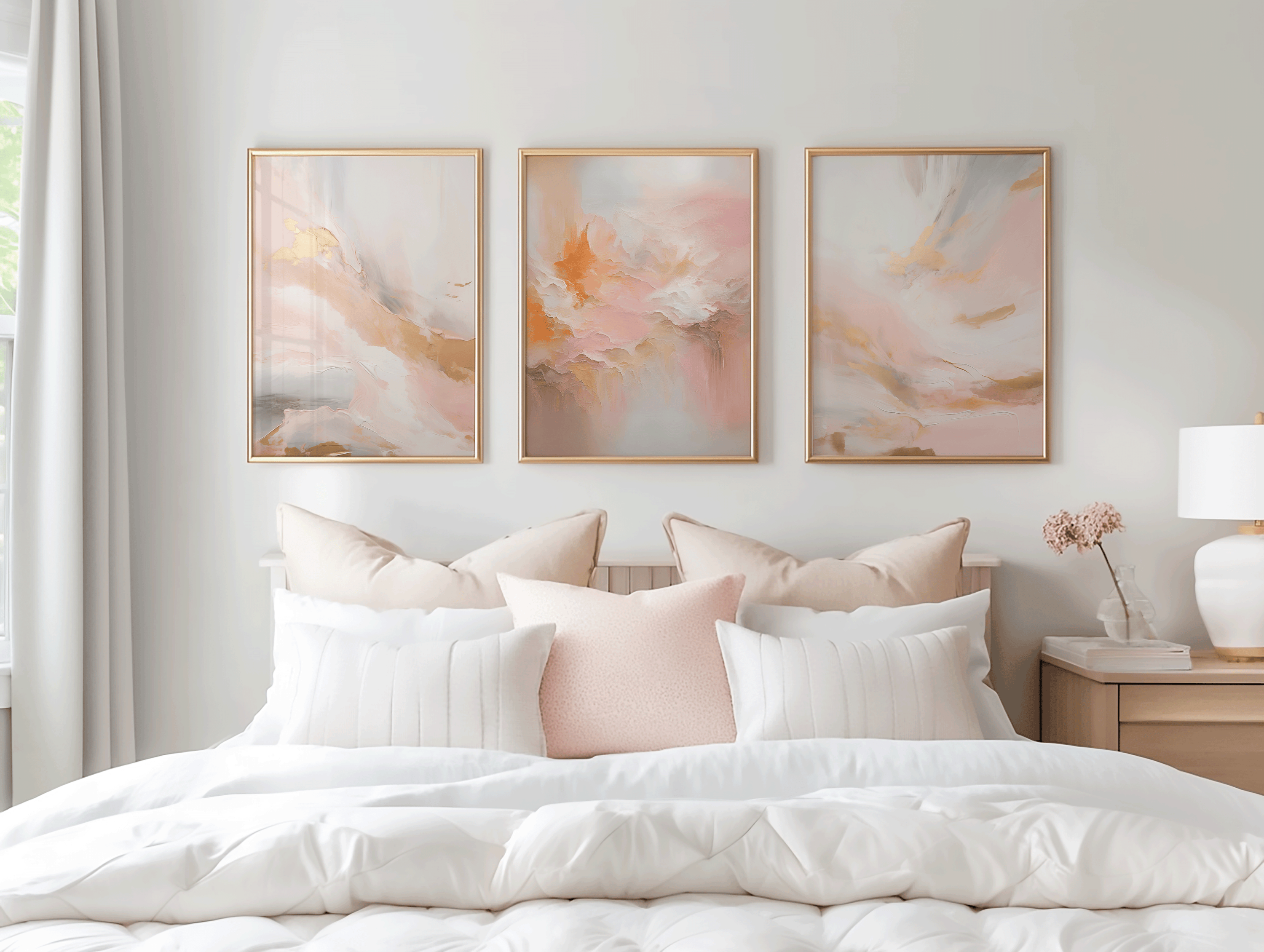
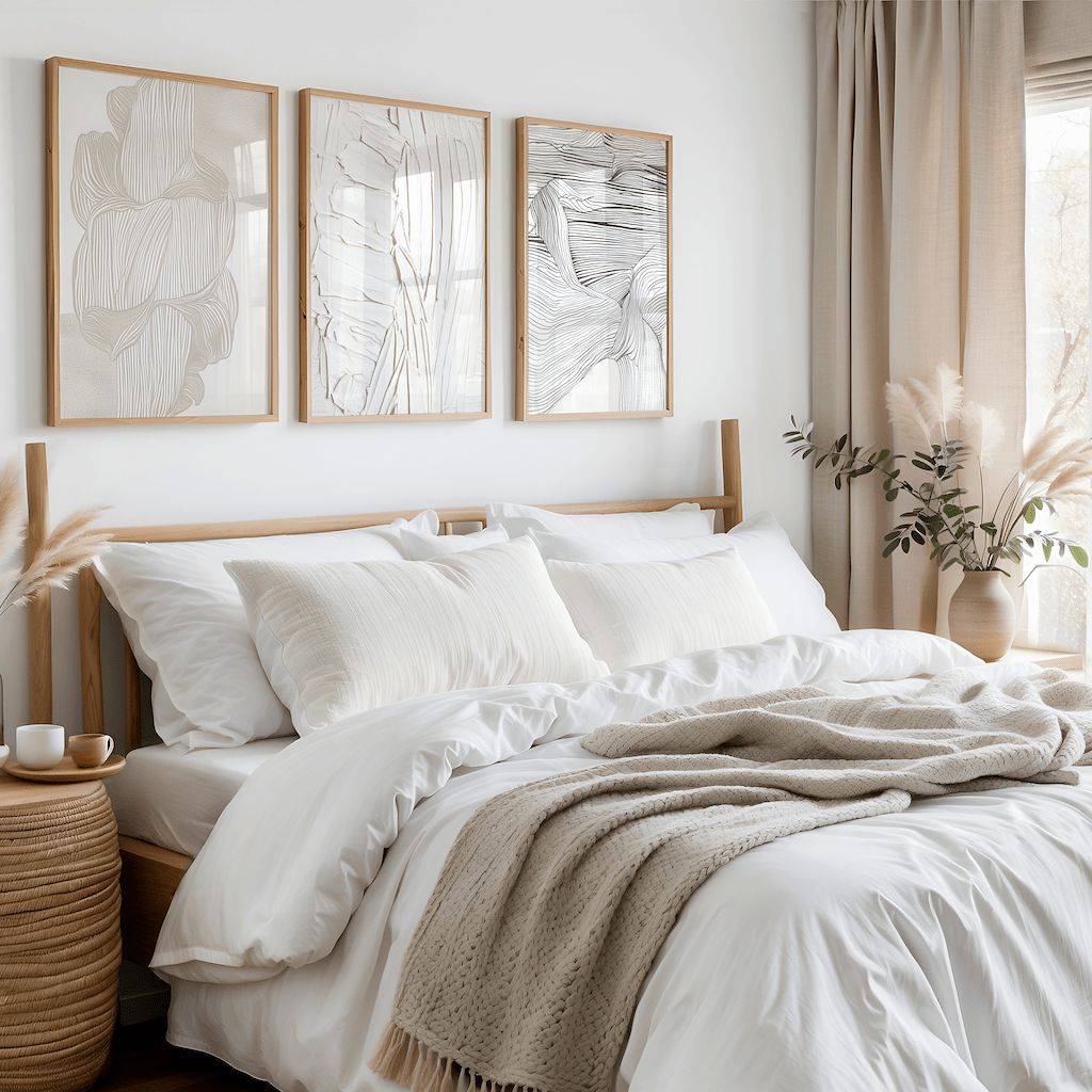
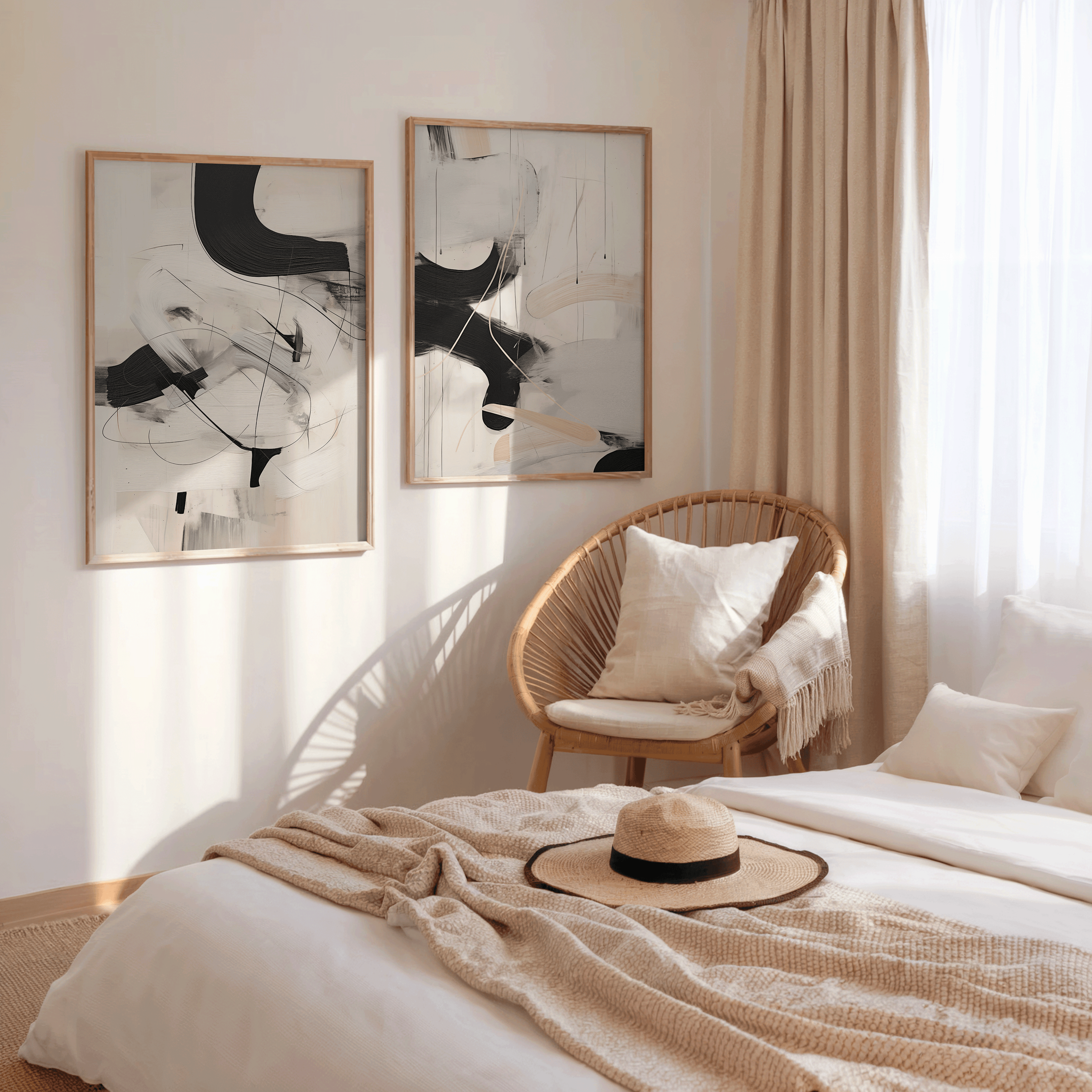
For beds, the same principle applies. Whether you choose one large framed print or a set of two or three pieces, the combined width should equal roughly two thirds of the headboard. This creates balance without overpowering the bed. A good rule of thumb is for the artwork to cover roughly two thirds of the furniture beneath it.

Over a Console Table or Sideboard
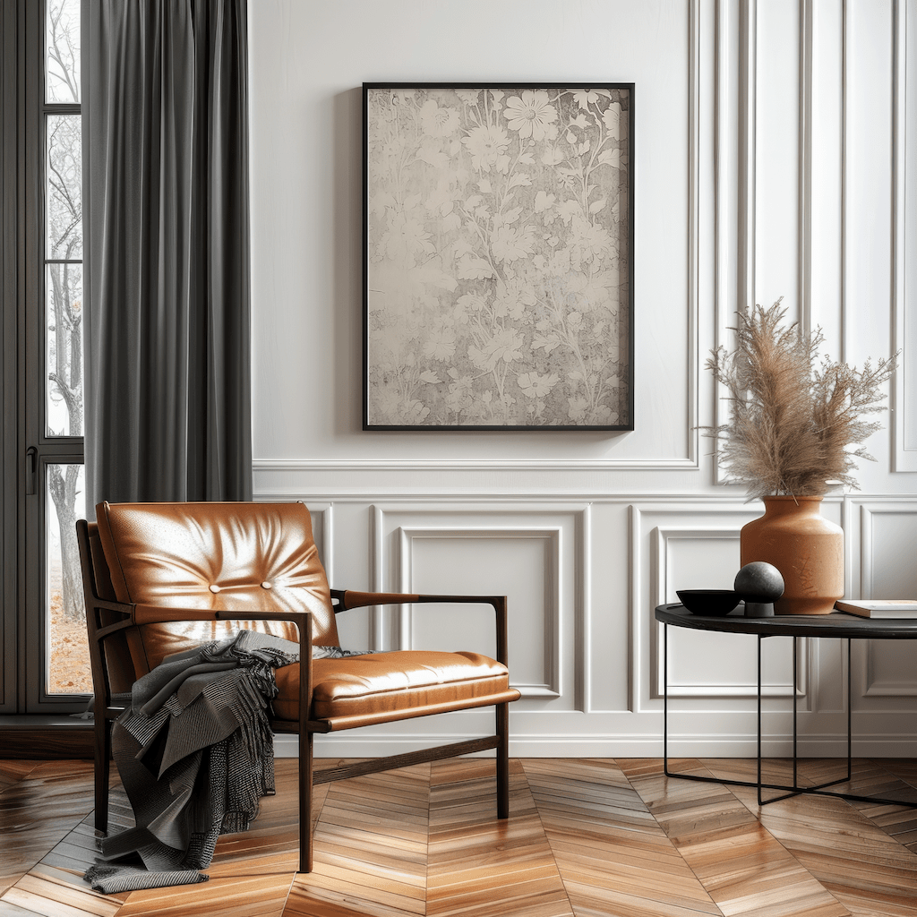
Wall art above a console should relate to the furniture below it. Choose a piece or grouping that fills roughly two thirds of the table’s width and hang it so the artwork visually connects to the surface rather than floating too high.

How the 2/3 Rule Works in Different Rooms
The 2/3 rule adapts easily to different spaces in your home, helping wall art feel balanced no matter the room. While the core idea stays the same—art should fill about two thirds of the width of the furniture below it—the way you apply it changes slightly depending on the layout and function of the space.
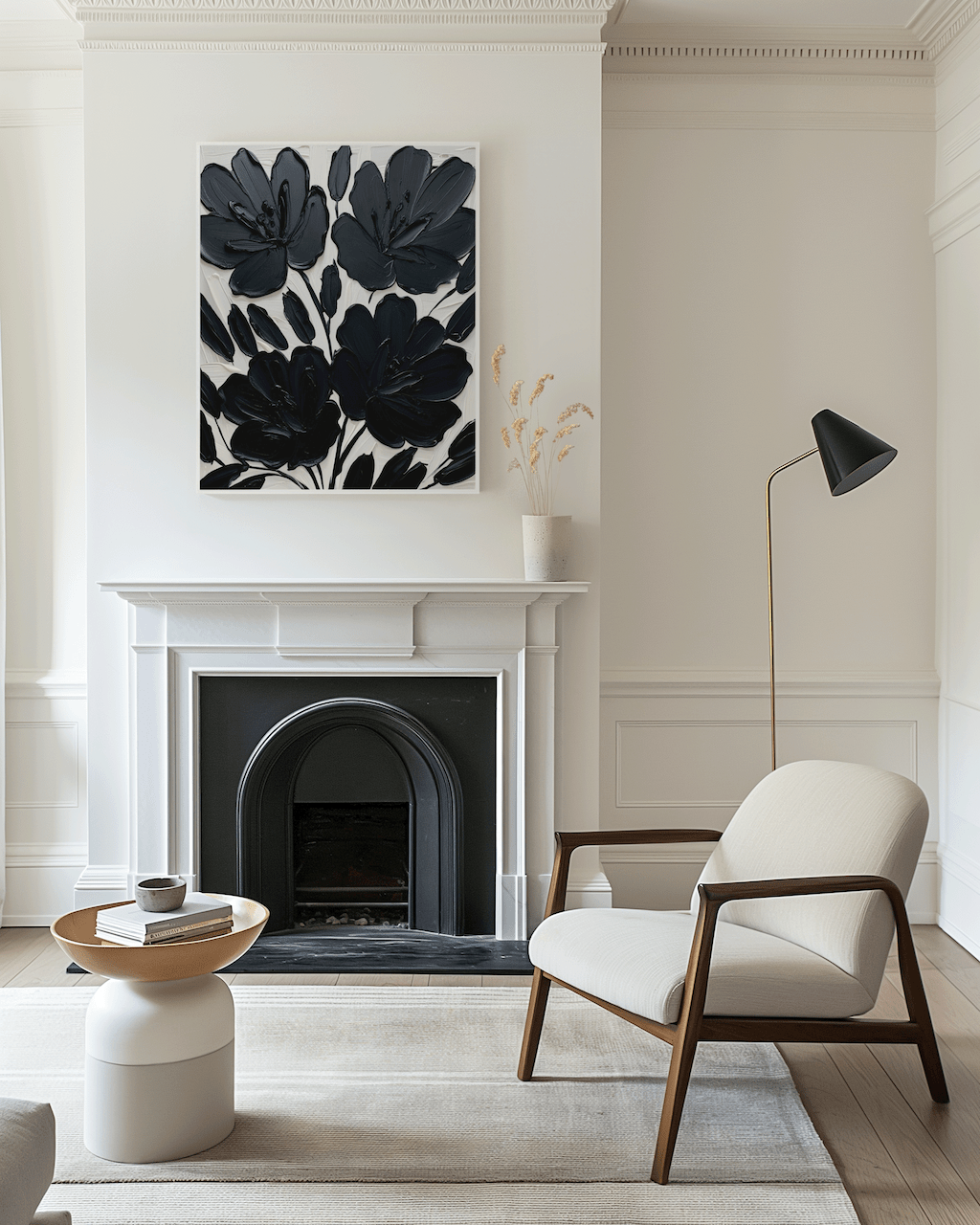
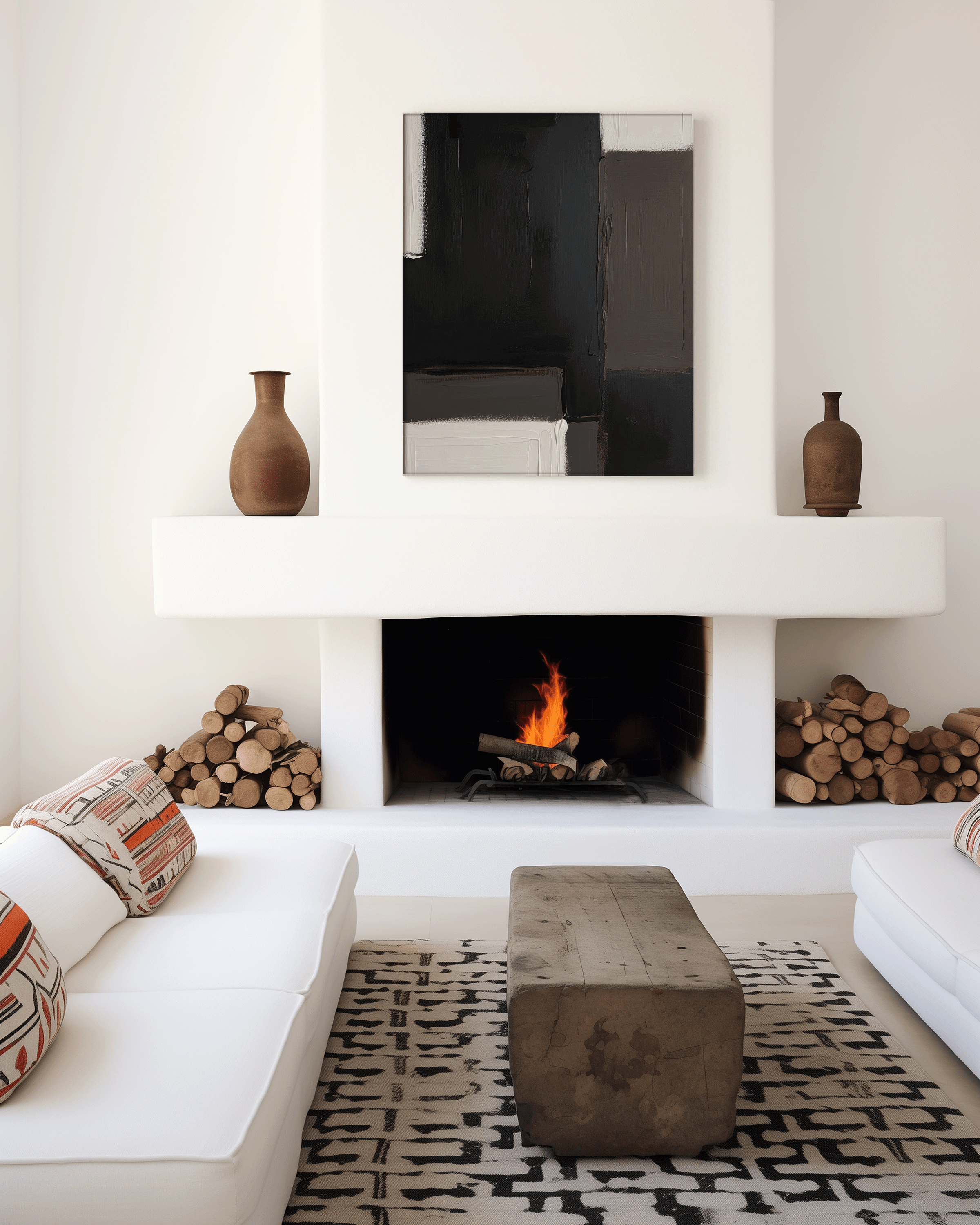
In living rooms, the rule works best when artwork spans roughly two thirds of the sofa or console table beneath it. This creates a strong visual anchor and prevents the wall from feeling top-heavy or disconnected. Whether you choose one large piece or a grouped arrangement, the goal is to make the art feel visually tied to the seating area.
In bedrooms, the 2/3 rule helps artwork feel grounded above the bed. A piece that’s too small can look lost, while something too wide can overpower the space. Centering artwork so it fills about two thirds of the bed’s width creates a balanced, intentional look that feels calm and cohesive.
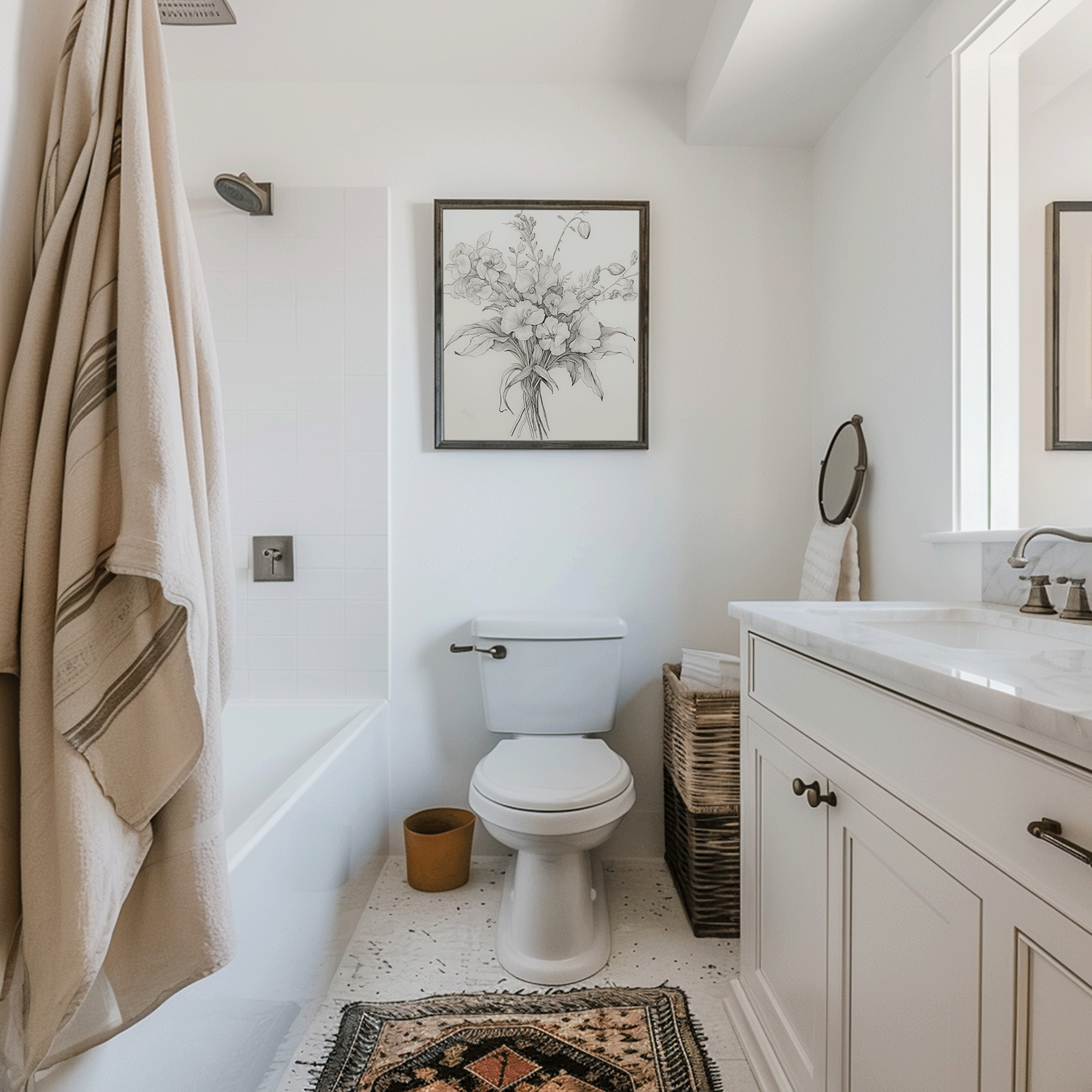
For dining rooms and entryways, the same principle applies. Art should relate to the furniture or console beneath it rather than floating alone on the wall. Following the 2/3 guideline helps maintain proportion and makes the space feel thoughtfully designed instead of randomly decorated.

Using this approach across different rooms ensures your wall art feels cohesive, well-scaled, and professionally styled throughout your home.
Additional Guidelines for Hanging Wall Art Correctly
While the 2/3 rule provides a strong foundation, a few additional guidelines can help ensure your wall art looks intentional and professionally styled.
Use Proper Spacing Between Pieces
When hanging multiple frames, spacing matters just as much as size. Leave about 2 to 4 inches between smaller frames and 4 to 6 inches between larger pieces. This spacing keeps the arrangement visually connected without feeling cluttered. When grouping several artworks, treat the entire grouping as one unified display rather than separate pieces.
Consider Wall Height and Overall Scale
Wall art should fill enough of the wall to feel intentional. Artwork that is too small can appear lost, while oversized pieces can overwhelm the space. As a general rule, artwork should take up about two thirds of the available wall width and sit at a height that feels naturally aligned with the furniture below.
Use the 57-Inch Rule for Ideal Viewing Height
A reliable guideline is to position the center of your artwork approximately 57 inches from the floor, which aligns with average eye level. This ensures the artwork feels comfortable to view and visually balanced within the room.
For a deeper explanation of how this works and when to adjust it, see our full guide on how high to hang wall art using the 57 inch rule.
Adjust for Furniture and Room Layout
When artwork hangs above furniture, such as a sofa, console, or bed, it should sit about 6 to 8 inches above the top of the furniture. This keeps the art connected to the piece rather than floating too high on the wall.
Avoid Common Hanging Mistakes
Hanging art too high, using frames that are too small, or spacing pieces too far apart can disrupt visual flow. Always consider the relationship between the artwork, the surrounding furniture, and the available wall space to create a cohesive look.
Use Proper Hardware and Lighting
Secure hardware helps keep artwork level and prevents shifting over time. Proper lighting also plays a role; soft, indirect lighting highlights artwork without creating glare or harsh shadows.
Using the 2/3 Rule for Gallery Walls
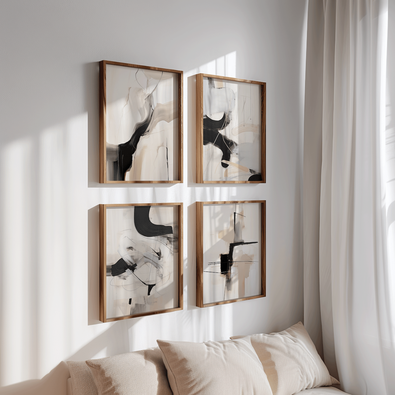
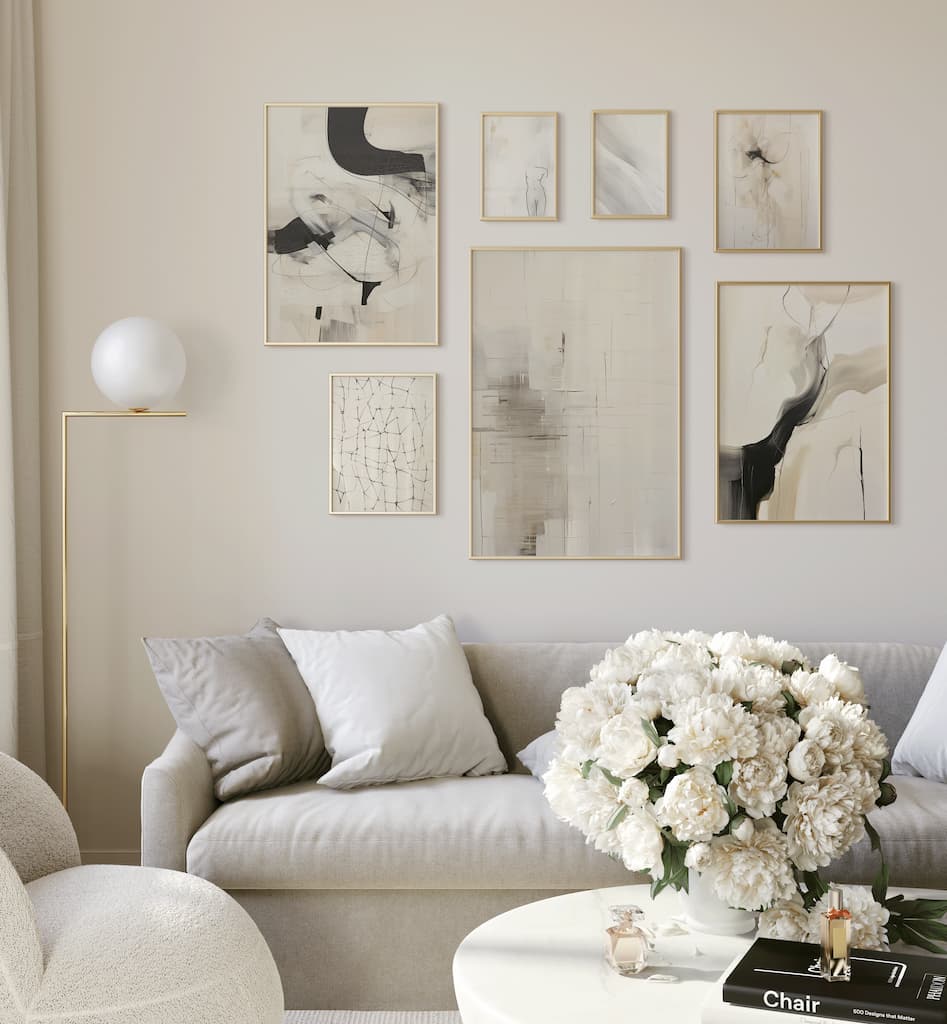
Gallery walls follow the same principle but on a larger scale. Treat the entire arrangement as one unit rather than focusing on individual frames. The full grouping should align with the width of the furniture or wall section beneath it.
When creating a gallery wall, lay out your frames on the floor first to find the right balance before hanging. This helps maintain consistent spacing and prevents uneven placement.
Why the 2/3 Rule Works So Well
The reason this rule works is simple: it mirrors how the human eye naturally processes space. When artwork occupies about two thirds of the available width, it feels grounded and visually stable. This creates a natural focal point without overwhelming the room.
Following the 2/3 rule also prevents common design mistakes like hanging art too high, choosing pieces that feel undersized, or creating awkward gaps between furniture and artwork.
Common Mistakes to Avoid
One of the biggest mistakes people make is centering artwork on the wall instead of centering it in relation to furniture. Another common issue is choosing art that is too small, which makes even beautiful pieces feel lost on the wall.
Avoid hanging artwork too high or spacing pieces too far apart. These mistakes can break the visual flow of the room and make the space feel disconnected.
Hanging artwork too high or choosing pieces that are too small for the wall can make the space feel disconnected instead of cohesive.
Frequently Asked Questions
What is the 2/3 rule for wall art?
The 2/3 rule means artwork should be about two thirds the width of the furniture it hangs above, creating a balanced and proportional look.
How high should wall art be hung?
In most rooms, the center of the artwork should sit about 57 inches from the floor or roughly 6 to 8 inches above furniture.
Does the 2/3 rule work for gallery walls?
Yes. Treat the entire gallery wall as one unit and apply the two thirds measurement to the overall width.
Can I break the 2/3 rule?
You can, but it works best as a starting point. Once you understand it, you can adjust intentionally based on ceiling height, room size, or style preferences.
Final Thoughts
The 2/3 rule is one of the simplest ways to make wall art look intentional, balanced, and professionally styled. By choosing artwork that fits the scale of your furniture and placing it at the right height, you create a space that feels cohesive instead of cluttered or unfinished. Whether you’re styling a living room, bedroom, or entryway, this rule removes the guesswork and helps your walls feel thoughtfully designed.
If you’re ready to apply the 2/3 rule in your own space, choosing the right size and placement of artwork ensures your wall art enhances the entire room rather than competing with it.
Explore our curated collection of wall art designed to fit beautifully above sofas, beds, and consoles, and find pieces that bring your space together with confidence and ease.


