Choosing wall art is about more than just the image. The right color scheme can completely shift how your living room feels, from calm and cozy to bold and energizing. And if you're not sure what colors go best with your furniture or space, you're not alone.
This guide will help you choose the perfect wall art colors that work with your room, reflect your style, and actually look good once they’re on the wall.

Key Takeaways
- Pick wall art that echoes or contrasts your furniture and accent colors
- Neutral palettes (beige, greys, soft greens) are timeless and easy to style
- Warm tones (rust, terracotta, blush) make your living room feel inviting
- Use art to introduce color if your space is mostly neutral
Choosing Wall Art Colors Based on Your Sofa
Your sofa is usually the largest piece of furniture in your living room, so let it guide your color choices.
- Grey or beige sofas work well with black-and-white prints, neutrals, or earthy tones like clay or olive
- Dark sofas (navy, forest green) pop with lighter, airy prints
- White or cream sofas pair beautifully with bold abstracts or colorful botanicals
When in doubt, pull one or two accent colors from your pillows or rug and find wall art that includes those tones.

Warm vs. Cool Color Palettes: What Works Best?
Not sure if you want warm or cool tones in your art? Here’s how they impact a space:
- Warm tones (reds, oranges, yellows, terracotta) add energy and coziness
- Cool tones (blues, greens, greys) create calm and openness
You can also mix both for a more balanced, layered look. Just keep a consistent color story so everything feels connected.

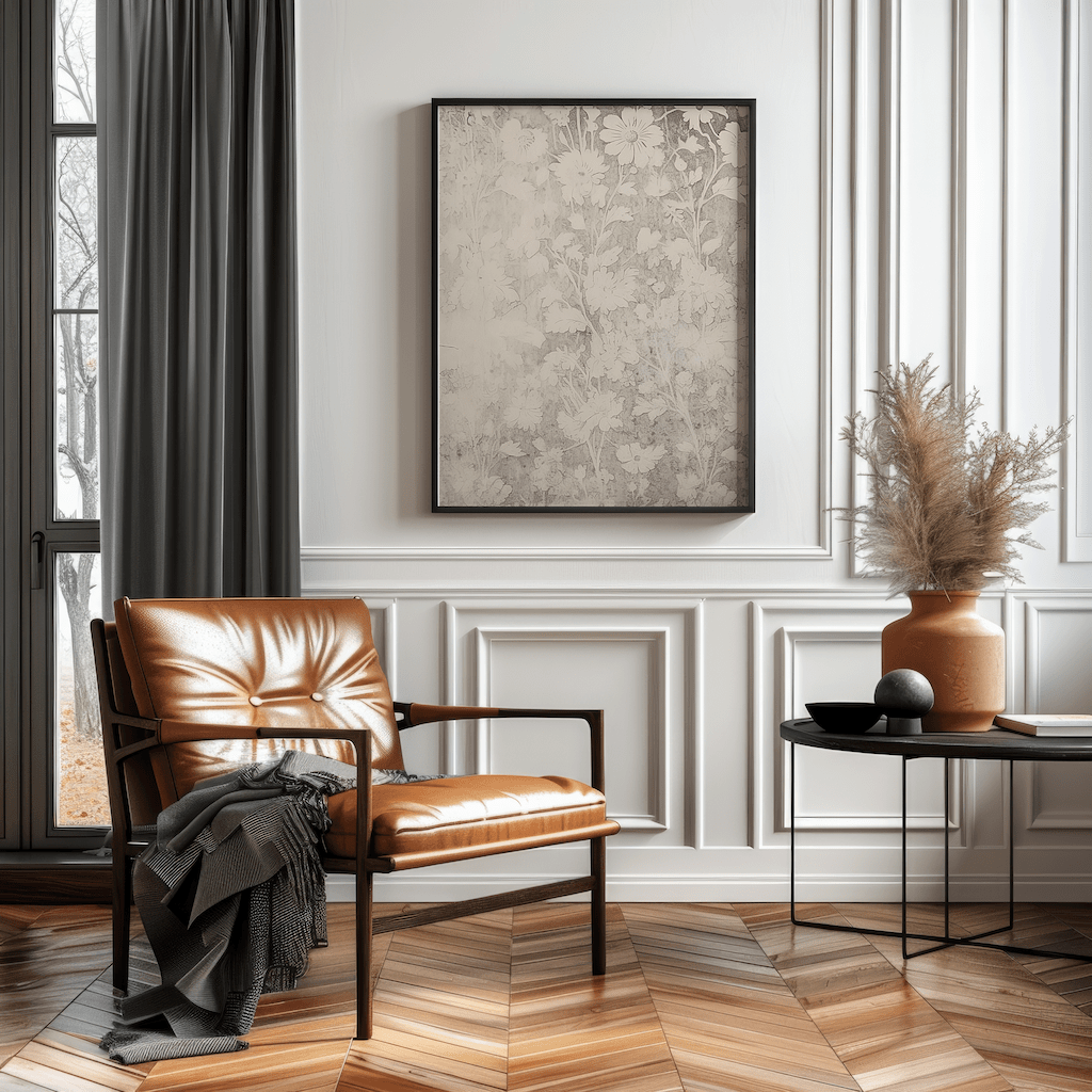
Neutral Wall Art for a Timeless Look
Neutral doesn’t mean boring. Creams, taupes, soft greys, and muted greens give your space an elevated, relaxed feel. Great for minimalist or modern homes.
Look for:
- Abstract neutrals
- Soft botanicals
- Line drawings or textured beige prints
Neutral canvas art also works great for resale or staging—it complements almost any furniture.

Trending Art Colors for 2025 Living Rooms
Want your space to feel fresh and current? These trending color schemes are all over interior design right now:
- Earthy terracottas and soft browns
- Dusty blues and pale sages
- Warm neutrals with golden beige and sandstone
- Moody darks like charcoal and forest green
Pair these tones with natural textures like linen, wood, and rattan for that cozy-modern vibe.
How to Use Art to Add a Pop of Color
If your space is mostly white, beige, or grey, art is the easiest way to bring in personality. Choose one color to highlight, like rust, navy, or mustard, and let your wall art carry it.
Tip: Use your art to guide your other decor picks. Once you have that anchor color, echo it in your pillows, throws, or vases.

Matching Art to Pillows, Rugs & Curtains
Your wall art doesn’t have to match perfectly—but it should feel like part of the same family.
Here’s how:
- Pull accent colors from your textiles and find prints with similar hues
- Mix textures: matte canvas art looks great with soft velvet or wool
- Use complementary colors (like blue + rust or green + beige) to build depth
Best Colors for Small Living Rooms
If your living room is on the smaller side, color can make a big difference.
- Stick to light, neutral art to reflect more light and open up the room
- Try vertical pieces to draw the eye upward
- Use warm tones to create a cozy, inviting feeling without closing in the space
Even one large piece with soft tones can make your room feel bigger and more finished.
Choosing Art for Open Concept Living Rooms
Open layouts can feel tricky when it comes to color. Here’s how to create flow:
- Choose a main color family that runs throughout your space (like greys and blues)
- Use wall art to bridge areas like the living and dining zones
- Repeat art tones in small decor like books, vases, or textiles for cohesion
This keeps your space visually connected, even if it’s multifunctional.

Frequently Asked Questions
What color art goes best with a beige or grey couch?
Earth tones like rust, clay, olive, or soft greens are a great match. Black-and-white prints also work well with neutral sofas.
Can I mix warm and cool colors in wall art?
Yes, just keep a consistent base color or tone to tie everything together. For example, mix warm rust with cool grey if they share a similar saturation.
What if my living room has no color scheme?
Start with a neutral base (beige, grey, cream) and add one or two art prints that bring in a pop of color. Let those prints guide the rest of your decor.
Style Your Space with Color
The right art colors make your living room feel more put together, inviting, and personal. Whether you want a calm, neutral vibe or a bold, colorful statement, there’s a palette that works for you.
And remember, color doesn’t just decorate—it creates atmosphere. The right shades can make a space feel cozy, open, grounded, or elevated.


